From Star Wars to Toy Story, film typography has introduced us to culturally iconic films that have filled our living rooms, bedrooms and cinemas with joy, since film began. Why do we remember them so well? Because they represent the story excellently.
By analysing the films typography from an audience’s perspective, I will be commenting on whether the film typography appeals to its genre, if it matches its story, conveys the right emotion and if it generally suits the film. I will explain what makes a successful piece of film typography.
1. Star Wars
For me, this is the most culturally iconic film typography within this post. I watched Star Wars from a young age, however I never thought about the film typography that it adopts. When thinking about its simplistic design, I soon realised there’s a message that has been subtly conveyed.
When Suzy Rice was trying to create the logo, they were making it for the first film, Star Wars: A New Hope. The logo is attempting to create a feeling of animosity, telling a story of a galaxy under contention through war. This is done particularly well through its hollow logo, exposing the vastness of the galaxy. However, hope is signified through the positive yellow outline of the logo. This shows no matter how dark times can get, there will always remain hope in the story of Star Wars.
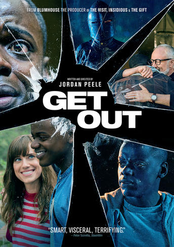
2. Get Out

Get Out was a great cinematic experience for me, it was intense and courageous, just like its typography. It’s simplistic and bold, it’s in your face and difficult to ignore, as it emphasises the importance, that the main protagonist needs to simply get out the situation he is about to get into.
The contrast of the black background and the white typography emphasises the importance of the title. The boldness of its Helvetica font, sends unsettling and curious contrasting messages to its potential audience. The familiarity of the font makes people feel more comfortable watching the film due to the font being embedded into society.
The other message Get Out sends is a warning that getting out won’t be as simple as its title seems. It’s simple and bold style, makes it seem easy but the fact it is overly bold makes it seem like a warning sign, generating interest.
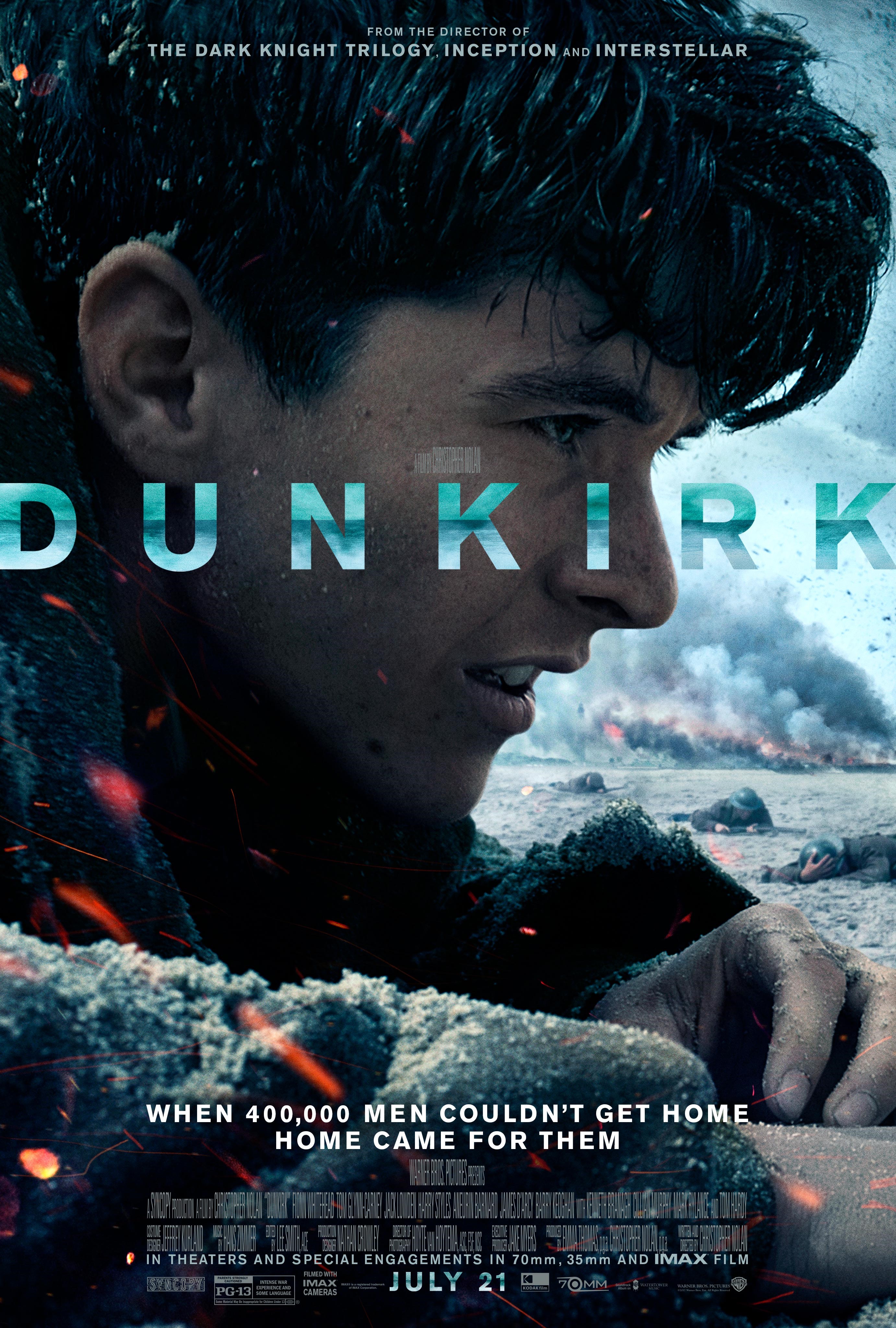
3. Dunkirk

Dunkirk will keep you on the edge of your seat, providing with you relentless and nail-biting action. Its typographic choices give its potential audience a great insight into what the tough environment of Dunkirk was like. Its movie title is cold and strong, using harsh imagery of the intense English Channel, providing a sense of what this film is like.
By using cold colours of blue, it provides an unsettling mood, generating interest for the audience. They know they’re not going to see a comfortable viewing but an action-packed one. Its coherence, legibility and suitability mean there’s no friction. The imagery of the sea and its colour choices match its environment perfectly as Dunkirk is a seaside town. Dunkirk uses a relatable, real life sans serif font, showing it won’t hold back on its 1940’s based action.
4. Toy Story
Lifting the mood a little bit with this film, Toy Story’s typography is youthfully mischievous, playful and bright, appealing to a younger audience. Its typography matches its story well. The typography is imperfect, with the composition of the letters at different irregular angles. The story follows the imperfections of certain characters.
The composition of the letters within the typography also signify that this film is light-hearted, fun and that when playing with toys, things can get messy. The playful colours that are used are all primary colours. The use of yellow, red and blue are familiar to everybody, especially its main target audience, young people. Not only is the colour used to attract its audience but its size of font as well, making it very easy to read.
All of these films are great examples of iconic film typography of their respected genres. They also perfectly match aspects of the films they represent, through either the environment, time or plot.
Next article, I will be taking a look at IMDB’S top 3 films of all time, how good is their typography?
